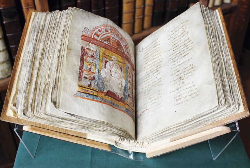
Saturday, June 28, 2025

Choices, Part 2

The Materials: Ink and Paper

First of all, let me be clear:  I love paint.  I want all the colors.  I can spend days making color charts.  Eight tubes of earth red oil colors is not overkill; believe me, Venetian red is not Pompeian red is not Terra Rosa is not Pozzuoli earth, and that's just Williamsburg.

And now there is INK. 

(A disclaimer, of sorts:  trials and practice have gone on now for more than a year.  This post is a description of where I started.  Some learning and plain old mind-changing have happened over time, which I'll eventually get to.  Probably.)

My back-of-the-drawer tools and supplies included an Osmiroid calligraphy pen from the 70s with nibs; a half-empty bottle of Higgins drawing ink with a funky smell and some...globs and another mostly empty bottle of THICK Pelikan blue fountain pen ink; and a couple of plastic nib holders and some Speedball B and C nibs, including a set for lefties (where did that come from?).  I put in an order to John Neal Books for some new ink, nibs, and two Pilot Parallel pens, so I could get going while I figured out what I was actually doing.

I tried all the papers I have on hand (hot and cold press watercolor paper from Arches, NY Central, and Fabriano; Hahnemuhle Bugra and Ingres; Canson Mi-Teintes, Ingres, and Edition; Rives BFK and Lightweight--OK, I also love paper), looking for one that was not too white, had minimal texture (but not very smooth), took both ink and paint well, wasn't too thick or stiff to fold for a book, and was still available (unlike beautiful Zerkall Nideggan) at a reasonable price. Eventually I settled on Arches Text Wove, a 100% cotton paper with (from the Velin d'Arches website) "very good mechanical strength [and the] pleasure of using a soft, supple, noble material [with] unbelievable feel."  Because who wouldn't want to work, for the weeks and months this project may take, on a surface both supple and noble?  A full sheet is 25 1/2 " x 40"--which cuts up pretty economically into eight bifolia per sheet with a folio (page) size of 6 3/8" x 10".

In the decades since I bought the now odorous ink, a whole cult of fountain pens and inks for them has grown up. There are artisan inks with names like "Squeteague," "Walks Over Vistula," and "Moon Jellyfish." Inks that shade, sheen, shimmer--and smell, on purpose, like violets or Christmas trees.  I wanted brown ink, because I like brown ink, but also for the look of age and to show some variation, a grayish brown, fairly dark. I had bought two from John Neal, Higgins sepia and Noodler's walnut, but wasn't happy with either one:  I worried that the Higgins wasn't really meant for fountain pens, and the Noodler's was just too red, a red that seeped to the edges of the letter, a kind of interesting effect but not what I wanted.

[Just as an example, Vanness Pen Shop has 309 products tagged as "brown" ink, with 76 choices from the manufacturer deAtramis alone.  And so many other colors!  I was in trouble.  (As in the Mark Knopfler song.)  Over the months I purchased more than a few, from several sources, but most of them are not quite right.]

I now have a walnut ink made from crystals (from peat, I think, like Van Dyck brown), a lovely color that works well with a dip pen but can't be used in fountain pens. Two iron gall inks that, again, can only go in the Osmiroid if I'm very careful about flushing it regularly. (Not likely.) To get started I used a safe choice, Pelikan brilliant brown modifed with a drop of black.

Then there's paint.  Illuminated manuscripts have pictures as well as words.  Calligraphers like Patricia Lovett recommend gouache for its opacity and adjustable consistency; others use watercolor.  I have a set of Shin Han gouache, which I like very much, and a full watercolor palette from experiments in the last couple of years--and a lifetime of painting.

Daniel Smith makes a line of mineral watercolors they call PrimaTek, and they have put together a sampler of cards with dots of all the colors.
I chose a few of these for my initial palette:  Jadeite (dark green), Sodalite (dark blue), Amethyst and Sugilite (violets, dark and light, with a little shimmer), Fuchsite (light green, also shimmery), and Mayan blue (lighter and more green).  (To my surprise, those dots go quite far!)  Cadmium Scarlet gouache for vermilion.  Some Schmincke gold gouache powder (bought at Pearl Paint in NYC at some point in the last century) for, well, gold.

Enough to get started.


Wednesday, June 18, 2025

Influences (Books)

Discovered (separately, years apart) while wandering around the library:

The Paper Garden: An Artist (Begins Her Life's Work) at 72, by Molly Peacock

One of Mary Delany's cut-paper "mosaicks"

Meetings with Remarkable Manuscripts: Twelve Journeys into the Medieval World, by Christopher de Hamel

The Codex Amiatinus

Thursday, May 29, 2025

Choices, Part 1

The beginning of any artwork, any project, involves a number of choices.  Sometimes it's easy: a drawing in a sketchbook needs no more than the book and a pencil (and maybe an eraser).  There the hardest choice is "which pencil?"

This illuminated manuscript I've undertaken has required quite a few more, almost all of them provisional.

The Text.  I chose The Lais of Marie de France, Text and Translation, edited and translated by Claire M. Waters (Broadview Press, 2018), because it includes all the lais, uses only Harley 978 for the text, and has the Old French text and the modern English translation on facing pages.

The Script.  Although I had been practicing textura quadrata, I decided in the interest of both authenticity and legibility to study and imitate the unnamed scribe of Harley 978.  I enlarged a piece of folio 118va until the thick parts of its letters matched the width of my pen (an Osmiroid calligraphy fountain pen from the early 1970s with a B-4 nib)  and started tracing.  Chris made me a slanted writing table with a plexiglass top I could illuminate from below that made both the lettering more comfortable and the tracing clearer.  Also, Canson XL Marker is a smooth, translucent paper that's a joy to write on.

Harley 978, fol. 118v and one of my traced pages

Many pages and days of practice followed before my hand got used to this script.

The Lai.  This book-to-be needs only one, but which one?  The romances of courtly love no longer appeal to my elderly self, which pretty much left Bisclavret, the tale of a werewolf, that enduring popular figure.


From a woodcut c.1475 in the Wellcome Collection, London


Saturday, May 17, 2025

Genesis

I belong to a book club.

This isn't unusual in this small town: it seems like everyone I meet belongs to a book club, but it's never the same one.  "My" book club is Women Read, sponsored by the local library.  By September, each member has chosen a book for the club to read in the coming (school) year and agreed to lead the discussion.  My choice for April of 2024 was Matrix, by Lauren Groff, a novel about the 12th-century writer known as Marie de France, which I had read earlier that year.

The novel so impressed and intrigued me that I began to research (i.e., gather information on the Web about) Marie and her writings, and came across a manuscript in the British Library (Harley 978**) that contained the twelve lais* attributed to her, written in Old French (or Anglo-Norman French, as she lived in England).  I downloaded a couple of pages; this is the Prologue.

British Library, Harley MS 978, f.118v

The manuscript was created sometime in the middle of the 13th century; again, not much is known of its provenance.  

Also attributed to Marie is a collection of verse translations of Aesop's Fables (Ysopet). Here is the first page from an illuminated manuscript in the national library of France.

Bibliothèque nationale de France. Bibliothèque de l'Arsenal. Ms-3142, f. 256r

And there my researches stood until it was close to time to talk about Matrix, Lauren Groff, and Marie de France for Women Read.  I decided to create a bookmark--because everybody likes a present.  In another revival of moribund skills, I found my calligraphy tools (some of them purchased 50+ years ago) and, on my shelf, the book Medieval Calligraphy: Its History and Technique by Marc Drogin, and started practicing early Gothic and textura quadrata scripts.  With the "portrait" of Marie from the page above, printed on Pergamenata paper (parchment-like, sorta), and gold acrylic paint for the "gilded" parts, the bookmark emerged.


The book club liked the bookmark.  I liked the calligraphy practice.


I liked trying new pens, inks, and paper (I do love collecting tools and supplies and materials).  In college I liked my courses on the Middle Ages, which included one on the history of the French language.  I like looking at medieval manuscripts.  I like book arts.  I like textile and fiber arts.  I like embroidery and beading.  I even like to paint.  

I like...making things.

While looking for a good book on embroidery techniques at the library, I came across a book called Celtic, Viking & Anglo-Saxon Embroidery by Jan Messent, an English artist whose main medium is embroidery. Rather than a history or a how-to book, it is a record of several of Messent's projects inspired by her love of textiles and design from the Anglo-Saxon period with all its influences.  I was thrilled and excited.  Here were books and boxes and textile pieces that combined all sorts of interests and techniques in ways that were both beautiful and informative.

Celtic Influences, page 17

I wanted to do something like that, a project that would combine my interests and my skills; a big, slow project that could be done in pieces as I had time and energy and focus for it.

And so, five months after the bookmark, I decided to make an illuminated manuscript of one of Marie's lais.


**********
*A lai (or lay) is a "short, rhymed tale of love and chivalry, often involving supernatural and fairy-world Celtic motifs."  From Wikipedia.

**In October 2023, the British Library experienced a significant cyber-attack that disrupted many of their services, including access to their astounding collection of digitized manuscripts.  Although they have been able to make some of the collection available again, Harley 978 isn't included.  Harley 978 is also the source of the Middle English song "Sumer is icumen in."


The Marie Project


Marie Project:  Frontispiece (f.3r)

I'm calling this activity of the last year The Marie Project.  It encompasses more than art making: I've been studying in my haphazard, undirected, autodidact way medieval history, manuscript studies, paleography, old French, 12th-century costume, calligraphy, historical scripts, gilding. My fingers are crossed that it will all come together eventually.


Resurrection

Eleven years later, this blog still exists.  I guess I'll try using it again, after some editing.  There were lots of broken links and outdated announcements, and I'm still pondering whether to delete some WIP posts that in retrospect just seem repetitive.  Also, it seems like there was an inverse relationship between the success of the painting and how many photos I took and posted.  

It's been some time since I retired from the business of art making, the galleries, openings, submissions to shows, carting the paintings around, trying to do marketing with the website and this blog.  I really don't miss most of it.  However, I have been recently reminded how much I do like to talk (and write) about what I do.  It gives me some clarity, a little distance, a bit of perspective; and I like the opportunity to share what I've learned about materials and techniques.

My intention here is to document my current long-term project (it will take a while to catch up), and also to use this space to archive some work, now that the website is defunct.

So here goes.


Tuesday, April 8, 2014

ArtFields 2014

Off to Lake City again on Thursday to deliver Kitchen Aria, which has been accepted into this year's ArtFields, April 25th through May 4th.

Kitchen Aria (2013), 24"x28", oil on linen

The painting will be hanging at Tobacco Row restaurant, 127 Sauls St., Lake City, SC.  I plan to do a demo at the restaurant on May 2nd, a portrait drawing (maybe pastel), and be available to answer questions and get whatever kind of feedback happens by.  Chris has agreed to be my model and we'll be there for at least an hour starting at 1 PM.

Friday, December 6, 2013

Self-portrait in pastel

On a half-sheet of, I think, gray Ingres paper.  Which is now apparently made by Canson.

Ellen Eagle's book Pastel Painting Atelier appeared at my local library and I found it very inspiring.  Her work (at least in the book) is mostly portraits; her drawing is lovely and her pastel technique both skillful and somehow relaxed.

It was fun to work with pastels again after several years; there's a lot I've forgotten and a lot I never knew.  But I discovered that after working with neutral grays in oils, I really wanted more neutralized colors in pastel, especially low-chroma red-oranges ("brown").  So I tried to make some.  But that's another post.

Friday, February 15, 2013

Work in Progress: Beginning

This may be dangerous but I'll give it a try.

Here is the beginning of making a painting. (Additional interim stages may or may not appear depending on how I feel about them and whether I can grab Chris for a photo before I move on.) I start with an idea and then take photos, in this case of my kitchen and the model. From the photos I'll work up one or more drawings—like the one in the post from last week below. This week I've made a sketch the proportions of a large (for me: 24"H x 28"W) already prepared canvas, for which I also have a frame. The sketch is about 9" x 11".

Preliminary sketch for 24"x 28" painting

But I wasn't entirely happy with the feel of this one, so I scanned the drawing and cropped it a couple of other ways (yes, I have canvases and frames in these sizes as well). This is my favorite 18"x 16" size; it's so comfortable for me that I'm afraid I unconsciously compose for it.

Preliminary sketch for 18"x 16" painting

Then a 24" square.

Preliminary sketch, 24"x 24"

And finally the original canvas oriented vertically.


I would like to make a larger painting. Canvases bigger than about 20" in any direction are a challenge for me—I've spent a lot of time on several that never left the studio—but with the coming of spring it may be time to venture timidly out of my comfort zone.

Tuesday, February 5, 2013

Back to the Drawing Board


Study for an upcoming painting, charcoal on gray laid paper, about 11½" x 7½". I'm trying to do more drawing and also to use drawing to figure out paintings before I've got a couple of weeks in them and discover some insoluble or even simply intractable problem. Now that I've looked at this for a couple of days I can see things that I'd like to change before I paint, but I'm developing familiarity with the figure and considering background options. So it's a good step.